back to sierranevada.edu

Friday, April 30, 2010

New York: The City That Never Sleeps. (We didn’t sleep much, either.)

The City That Never Sleeps

Celebrity: "Hey Ladies"

Subway's Blur (Featuring Gabor and Jill)


Walking, walking, walking, subway, walking, walking, art, art,
walking, art, walking.
Times Square. Brighter at night than during the day. Illumination from
billboards telling us what we need to be fulfilled.
Central Park. The only place with true green, that of nature.
Daffodils pushing their way up, reminding us that life does exist
within the dirt. It is not all a concrete jungle.
Art museums. One after another. So many, you forget what you’ve seen,
and what you’ve dreamt. Beauty resting on a wall in front of you:
unreal to the senses. Everything becomes breathtaking and fantasy-esque.
Celebrities, living life. Bums, trying to get by. Musicians, trying to
make it. Tourists, enjoying life and the sights.
Gypsy cabs: be wary of those.
Broadway, opera, jazz clubs, & talent. Talent over flowing every
street corner and alleyway.
New York City: people, everywhere. The City That Never Sleeps.
Why would you want to? There is far too much to absorb to ever shut
your eyes.

Wednesday, April 28, 2010

Indian Food, Point Blank

Last Thursday, Kat Hutter (instructor of painting, design, mixed media, and gallery coordinator) had her opening for "Point Blank," held at the McKinley Arts & Culture Center in Reno, Nevada. The opening was a success and the paintings were, of course, beautifully executed and displayed.


After much beer, chatter, and guacamole,
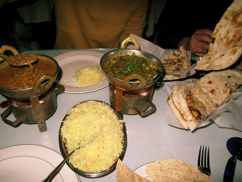
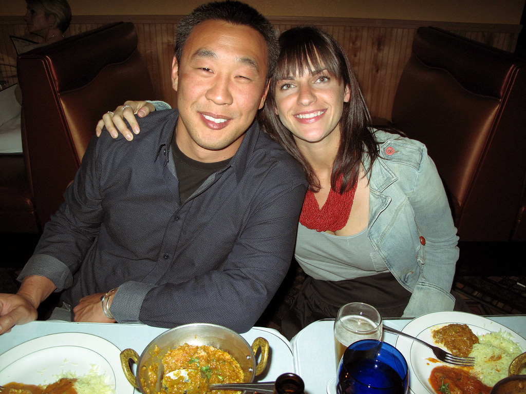
friends, colleagues, and students of Kat went to Indian food
to carry on the festivities.


Tomorrow evening, April 29th, is Becca Jane's BFA opening titled
"Small Thoughts From Strange Hours."

Along with her show,
there will be BA artwork displayed
and the juried exhibition "Craigslist."

Sunday, April 25, 2010

Luck of the Draw

Cody Garcia's BFA show, "Willy B. Lucky," had a good dose of cartoonish verve. The brightest splashes of color were four cut-paper scenes following the adventures of the show's titular character, Willy, making his way through a casino. The one wall without the cut-paper pictures was painted with nearly life-size silhouettes of casino denizens, bored dealers and unctuous servers and gambling shmoes. Cody set up the gallery for maximum casino ambiance, stationing a bartender in one corner, setting up a couple round tables with red tablecloths, and piping in rat pack music (the music murmured like a haunted historical echo of the Cal-Neva, which had just shut its doors a couple weeks before). Outside the gallery was a small ceramic sculpture of an old man with a pair of cards balanced in one hand, frozen in the moment before he's about to slap them on the table.


Cody's interested in being a character designer, and the show was a good distillation of lessons he's learned at school, through online courses, and with his own disciplined practiced and research. As far as influences go, I know he admired Lou Romano's design work for "Up"(which we were fortunate to see in person during a small student visit to Pixar we were able to arrange last year, thanks to the graces of Erica Milsom), the exaggerated plasticity of the characters owes something to the rubber-band anatomy of Tex Avery, and I thought I could detect some of the geometry of Mary Blair's designs for Disney in the flat boldness of his compositions. The cut paper technique really seemed to suit him, forcing him to concentrate on dynamic, essential shapes. There was a wonderful playfulness in how Cody pried certain pieces of the paper up from the two-dimensional surfaces of the images, so that a cigar or a die-throwing hand might jut out of the picture plane, casting its own shadow over the proceedings. I enjoyed the way he curved arms into elbowless tubes, loop-de-loops of form that swooped you through the activity of each vignette.


(Cody mentioned he identified with Willy somewhat, though I've never known Cody to sport a mustache. Below, a model recreates his posture as a caricature, complete with levitating tie action. It was amusing, when the reception was in full swing, to see the painted silhouettes blending with the live audience in the dim light.)


The humor in the images was pretty gentle (and this is probably my own bias against Casino culture rearing its head). I can go for kitsch and camp in certain doses and distillations, but Casinos usually defeat me. The tackiness is too close an objective correlative to naked human misery in that milieu -- something to do with the alchemical properties of hard liquor, cigarette smoke, and flop sweat. Cody shows some traces of the gruesome here and there (most directly in the silhouette of a woman slouched in front of her small pile of chips, hooked up to an oxygen machine by a thin tube that squiggles up into her nostril), but the images are more of a rib-nudging than real satire. Cody has a sense of humor that's sharper and more perverse in person than what usually shows up on his drawing board.


On the other hand, too much poison in the images might have cramped his style as a host. Anyone who has seen his spot-on caricatures of his friends (popping up on his sketchbook, his blog, and the occasional classroom whiteboard) could intuit the social dimension of his work. He needed to put on an art show, but he also wanted to put on a party. Dressed in black with a ruby red bowtie, he clearly enjoyed being master of ceremonies for a night. Like Willy -- in one picture enthusiastically ordering a round -- for the time being, the drinks were on him.


(the last pic was taken by Kath McGaughey)

Tuesday, April 20, 2010

Art Events this week

UPDATE -- Joe had to cancel today's lecture due to the foul weather -- he's rescheduled for next Tuesday.

A couple things this week: first off, today Joeseph DeLappe will be giving a talk in the art building at 4pm. He's a new media artist and Professor of Digital Art at UNR -- his work is fascinating and it promises to be a great talk. His website is here.


And this Thursday, there's a reception for art faculty Kat Hutter's solo show at the McKinley Art Center in Reno. Kay says: "Please come see my latest work 'revolving' around ideas and symbols of power covered and 'prettified' in our society." Here's the info:

"Point Blank" : New Paintings by Kat Hutter
Thursday, April 22, 2010
Time:
5:00pm - 7:00pm
Location:
McKinley Gallery East
Street:
925 Riverside Dr.
City/Town:
Reno, NV

The show will run from April 4-May 14, 2010. And here's the Facebook event page if you want to RSVP.

Thursday, April 15, 2010

Dark Light

In Babs Laukat's BFA show, "Lustre Noir," the space was arranged around a series of inversions. Shapes squatting in a corner were echoed by shapes dangling from the ceiling, live flowers were set against a frame of artificial flowers, liquid water dripped and spattered against hard shards of glass. It was as if a set of conversions were being worked out: a sense of movement among the pieces made the images seem transactional, rather than static and resolved. A large chandelier (which, draped with tattered fabric, looked as much like a squid as a chandelier) held globes of ice, in which roses were frozen. As the ice melted, water dripped into a basin of shattered glass, which in turn sent fractured, melting shadows across the walls. A looped video projected onto the wall seemed at times to absorb these shadows and congeal them into more definite forms. Watching the video, you might gradually become aware that behind you, on a set of ascending shelves, orchids in glass containers were slowly growing, regardless of your attention. There was a subtle but consistent activity of dissolution, decay, growth, reconstitution.


In her talk, Babs explained her fascination with dualities, especially as they're worked out along the gender divide. She said she felt the present arrangement of dualities causes neurosis, and some of the seeds of her work were planted in a class on transpersonal psychology. In the work itself, Freud seemed to loom larger than Jung. An empty black dress, ruffled along a stark metal scaffolding, was parted to reveal a vacancy whose floor was covered in a thin layer of dirt. The humid chandelier patiently secreted its contents into the mirrored basin (the next morning, the collecting pool was faintly pink, suspending a solution of leached rose petal).


The opposition of gender stereotypes was "resolved" by a nearly life-size image of transsexual fashionplate (and David LaChapelle muse) Amanda Lepore, scaled and lit like an official portrait of a president, CEO or dictator (and actually, that scale might be too small for LePore, whose lips call out for billboard-sized framing). She stared out of the portrait like a surveyor of the work. The picture was cut off at the knees, but two arched shoes were set out in front of it, cobbled from welded steel.


The video, pieced together with public domain clips from the Prelinger Archive, dissolved stereotypically gendered images on top of one another. There is a cowboy riding a horse along a a plain, flowers that bloom in accelerated time lapse, a toothy female smile that stutters in an insistent loop, a mushroom cloud slowly raising its cephalopod dome, a quaint stripper who swings in and out of her disclosures between two luxuriant feather fans. Presented as a list, the images sound overdetermined -- and it would seem the switchbacks could only function as camp. But rather than editing from one image to the other, Babs superimposed them. Instead of being aware of cultural oppositions, you see connections being forged between them, in largely formal terms. A motion or a texture jumps from one image to the next, as they share a moment of time and interpenetrated space. The stamping of the horse's hooves seems to cause the flowers to burst open. The stripper emerges, diaphanous, from the convulsed clouds of a nuclear detonation, debris and dust shivering into fluttering feathers.


The work struck me as being strangely utopian. There was something gloomy about the space she created -- something dim and subterranean. At first glance, nothing seems to be truly resolved. Babs mentioned a desire to "solve the differences" that she sees in our cultural divides. But her synthesis seemed to rest on an embrace of artificiality, the way Amanda Lepore wears her femininity as an image, rather than a destiny.

Beyond that, however, the natural materials and processes evoked something more fundamental. The room had the kind of tenderness sleep can contain, when you're really craving it. I imagined Babs cultivating and caring for her images in the way she cultivated and cared for her orchids.


Tuesday, April 13, 2010

All a game

A few gaming-related links today. First off, I'd like to point readers to another SNC student blog, "Baron's Gaming Blog," maintained by Computer Science student Tyler Baron, located here:

http://barongames.blogspot.com/

Tyler has been making weekly posts about aspects of video game design -- his latest post was a critique of several cutscenes, and he's also looked at voice acting, the difference between "homage" and "ripoff," the way art direction can support or subvert gameplay, and several other topics. Anyone interested in the thinking process behind effective game design (or in its inverse, the "non-thinking process behind ineffective game design") would be well-advised to check it out. He has a pleasingly snarky style that makes for an amusing read.

There is also a visiting artist lecture this afternoon at UNR, by Eddo Stern, an artist who has used video games as both subject and production tool. It's at 4pm -- click on the below flyer for a larger version with all the pertinent info. It promises to be a fascinating talk.

Stern's website is http://www.eddostern.com/


Lastly, I recently came across the below video by someone who goes under the youtube handle "fluxlasers." He has used the user-generated content capabilities of the videogame Little Big Planet to recreate the first film in Matthew Barney's Cremaster cycle. I have to admit I'm not a huge fan of Barney's work, but seeing his video-game influenced white elephant art literally re-imagined as a video game makes me feel a bit more warmly toward it.