back to sierranevada.edu
Showing posts with label The Comics Journal. Show all posts

Saturday, September 10, 2011

Masereel, Herriman, Maggots

Well, clearly I didn't make good on my promise to keep the blog humming over the summer -- I ended up jealously guarding my writing time for the graphic novel I was working on. I did have a small handful of pieces published elsewhere during the summer, so I might as well get the ball back rolling again with links to those -- a couple short appreciations of some "art heroes" of mine, and a look at a graphic novel I admire very much.

The two appreciations were for Hilobrow.com, for their daily "HiLo Heroes" feature, which gives a tip of the hat to a wide variety of people (artists, physicists, actors, and on and on) on their birthdays. On July 31st, it was Frans Masereel's birthday, of whom I wrote:

Belgian artist FRANS MASEREEL (1889-1972) raged against the stupidity of war as an illustrator for a series of pacifist magazines and books. He was a propagandist, the clarity of his high-contrast style suited equally well to the crude printing-press and the ideological punchline, but his agitprop kept strong strains of slapstick and poetry.


Read the entire piece here.

Then, on August 22nd, it was George Herriman's birthday:

GEORGE HERRIMAN’s (1880-1944) comic strip “Krazy Kat” spun its three-point wheel for thirty years on the axis of a perfectly balanced love triangle (or masochism triangle — same difference). Much has been written about that triangle’s principals: Ignatz Mouse, a napoleonic id; Offisa Pup, upholding the prosaic squareness of Authority; and Krazy Kat, embodying grace as blank abuse (laid out by the missile of an Ignatz-hurled brick, Krazy might’ve said, like Swayzee, “Pain don’t hurt”).


Read the whole thing here. The piece also includes a link to a full-page comic appreciation I did for "Krazy Kat" back in the day, on the back page of the San Francisco Chronicle Book Review.

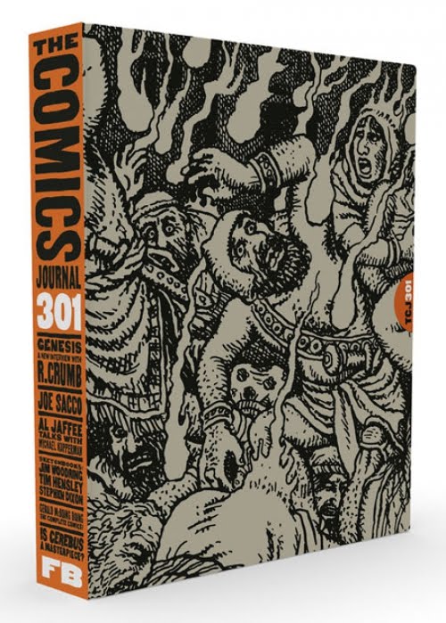
And lastly, I had a short piece in the brick-sized The Comics Journal #301. It was a look at Brian Chippendale's graphic novel Maggots -- which took a very distinctive approach to showing the passage of time. There's a nice overview of The Comics Journal #301 here at Win Wiacek's blog; and here's a paragraph from my article, contrasting the way time functions in classical painting, and the way it functions when we have access, through film or video, to the brief split-seconds:

This traditional pictorial surface doesn’t so much freeze time, as to put time in abeyance. This is not a snapshot record of an event, but a memory of an event, reconstituted after the fact, all its pertinent details congealed in an authoritative simultaneity. The duration of time there is not measured by moments, but by experiences. This is in contrast to the way an animator must reconstitute time – or the way one becomes conscious of time when scrubbing through a video clip, looking to isolate from the stream a representative still. The weirdness of time there is most evident in facial expressions – the way human visages are distorted into strange grimaces when motions become moments. A visual stimulus does not always rise to the occasion of an image; an image or a gesture is something that sustains itself beyond the imprint of the moment – something that lives as an echo in the mind after it’s vanished from the gelled chamber of the eye.

The article isn't available online, so you'll have to actually shell out for a copy (or, you know, just swing by my office and ask nicely to borrow mine).


Thursday, December 3, 2009

Wolverton's Apocalypse & Ware's Futurity

I've just had a couple pieces of writing published -- reviews of some interesting comics/books, by artists I admire. One is on a book of eccentric Bible Illustrations by Basil Wolverton, who made his name working on Mad Magazine and pulpy sci-fi and horror comics in the 40s and 50s.


It's up at The Comics Journal's new online site, here; The Comics Journal is moving into a much stronger online presence this month. They haven't had an "official launch" of the online version of their magazine yet, but there's already a good chunk of content up.

Here's a quote from the Wolverton article, describing his apocalyptic drawings, derived from the Book of Revelations:

Giant, luminous hailstones rain down to crush bloodied heads. Walking corpses with gaunt, ravaged faces stagger through rubbled wastelands. Mouths are reduced to organs fit only for yelling or screaming (oftentimes no teeth are shown, so the mouths are more like gaping wounds — some horrible hole driven into the face). The elements are in upheaval: flames leap higher than skyscrapers, the sea rises up in torsioned waterspouts, the sky ejects airplanes as though spitting watermelon seeds. There was always something toylike in Wolverton’s depiction of architecture, and in these vistas of destruction, the flimsiness of the skyline reads as a rebuke to man’s vanity. The listing skyscrapers look like shoeboxes, with equidistant little window-holes cut into them, being kicked over.

The other piece is appearing in issue #300 of the print version of The Comics Journal. It's a great issue: the bulk of it is taken up with interviews between younger and older generations of cartoonists. There's also some really sharp writing by R. Fiore and a great diagnosis of the ascendency of "Geek Culture" by Tom Crippen. I'm glad they were able to squeak in my review of Chris Ware's last book, Acme Novelty Library #19. Here's the first paragraph:

Part of the fun of Chris Ware’s Acme Novelty Library #19 is seeing him apply his style to a new mode. The first half is a science fiction adventure story, involving a desperate struggle for survival, a failed escape across inhospitable terrain, the murder of several dogs, and even a brief bout of auto-cannibalism. All this transpires on a faltering colony on Mars, and the arid setting allows Ware to maintain his usual formal distance without shortchanging the urgency of the plot. At its core, the story is one of abandonment – both intimate and infinite.

Issue #300 is currently only available in print, so to read the rest, you'll have to hit your local newsstand.

Monday, December 8, 2008

Topffer article in The Comics Journal


I have a longish essay in the latest Comics Journal, #294, which is now out. The essay is on Rodolphe Topffer, one of the early pioneers of the comic strip; his work has been collected in English translation only recently. He's one of my favorite artists, and in the article I try to get at some of his innovations -- to quote myself:

From a superficial glance, his work might seem to share much in common with his predecessors; for centuries artists had been creating images in sequence, using captions to explain the storyline. Töpffer didn't even push forward to adopt the last piece of the formal puzzle that would make his work unarguably "comics," the leap into speech balloons (or at least not in his published work -- he toyed with them in a notebook and then abandoned the approach). But there are two crucial differences in his method – differences that were in fact innovations – which keep his work feeling "modern," functioning as stories rather than specimens of graphic history.

The primal innovation was the injection of speed into the graphic narrative, both in the execution of the drawings themselves, and in the time that exists between the images. He's not drawing scenes, but moments. His images don’t languish in a buffer of time, adrift in temporality like islands at sea – they flow one after the other with a kind of ticking impatience. The sort of time he captures is unthinkable without the metronomic guillotine of the clock. There's a bit of a conundrum in this, in that each image seems to have a lesser duration (each panel sticks in the eye less than the framed quasi-theatrical dioramas of a typical broadsheet) – and yet more images are needed to elaborate the full circumference of an event, to feed the impatience of time.

Töpffer's other major innovation was his realization that the text and image need not support each other in a kind of explicatory unity (or redundancy), where one converges with the other toward a mutual vanishing point of agreed-upon meaning. Rather, text and image can exist on fundamentally parallel tracks, supporting each other in contradiction.

Text and image perform a dance of mutual commentary, not explanation. Two cohabitating modes of expression are yoked together in one singular medium, producing a habitat whose primary mode of meaning is divergence: in short, a universe defined by irony.

To find out why the rather pedestrian image below is one of my favorite panels in all of comics, you'll have to read the whole article.


The issue also has, among other things, interviews with the cartoonists Jason and Mark Tatulli, and an excellent article by R. Fiore, reviewing two books on the censorship of comics in the 50s, which is online in its entirety.