back to sierranevada.edu

Sunday, February 27, 2011

Counting Down

It's that time of the semester again; that time when the deadlines creep faster than we all can comprehend. Graduation in 2.5 months? Absurd! In spirit of the whiteboard countdowns that seem to crop up from time to time, I thought a nice post with a collection of dynamic countdowns could be a good bookmark for the coming weeks.


Countdowns created with OnePlusYou

Monday, February 21, 2011

Posterization

I've been meaning to do a blog post showing the posters for the films I'm screening in my independent film class, and some recent poster news is giving me a good impetus to close the deal. Chris Ware, one of the most interesting cartoonists around, has created a very distinctive poster for Uncle Boonme Who Can Recall His Past Lives, the latest film by Apichatpong Weerasethakul, one of the most interesting directors around. It's an unexpected intersection of two of my favorite artists. Click the image below to see a larger version of the poster:


I also might as well post a few more links pertinent to the art of movie posters, since I've been collecting that sort of thing in my bookmarks for a while (and it'll provide a helpful jumping-off point for my "Art & Advertising" class, which is starting a poster design project this week). First off, a link to posters commissioned by the Alamo Drafthouse, a famous venue for screening offbeat films; the Alamo is probably the most prominent source for limited-edition artist-designed posters for repertory films. I think of them as film-poster versions of a good cover tune. Below is an Alamo poster for The Shining:


An artist who's done several posters for the Alamo is Olly Moss, who has made several in the vein of the great designer Saul Bass -- here's a Bass-inflected design by Moss:


And to pick up again for a moment on The Shining kick (for some reason, that flick has inspired a lot of great repertory posters), below is a treatment done by Moxy Creative, for a series of redesigned posters inspired by Men's Style (thought in this particular case, it's more like ectoplasmic adolescent style):


Those Moxy posters trade on knowledge of the film -- they make more sense if you've already seen the movie. There seems to be a whole set of designers who make retroactive poster designs based on this sort of inside-baseball visual punning (like the Back to the Future 2 riff below, which I swiped from a blog post on "Minimalist Movie Poster Designs"):


And if you want to go really minimalist, you should check out filmtheblanks.com, a site where you can see movie posters reduced to their most iconic design elements -- The Deer Hunter gets the abstracting treatment here:


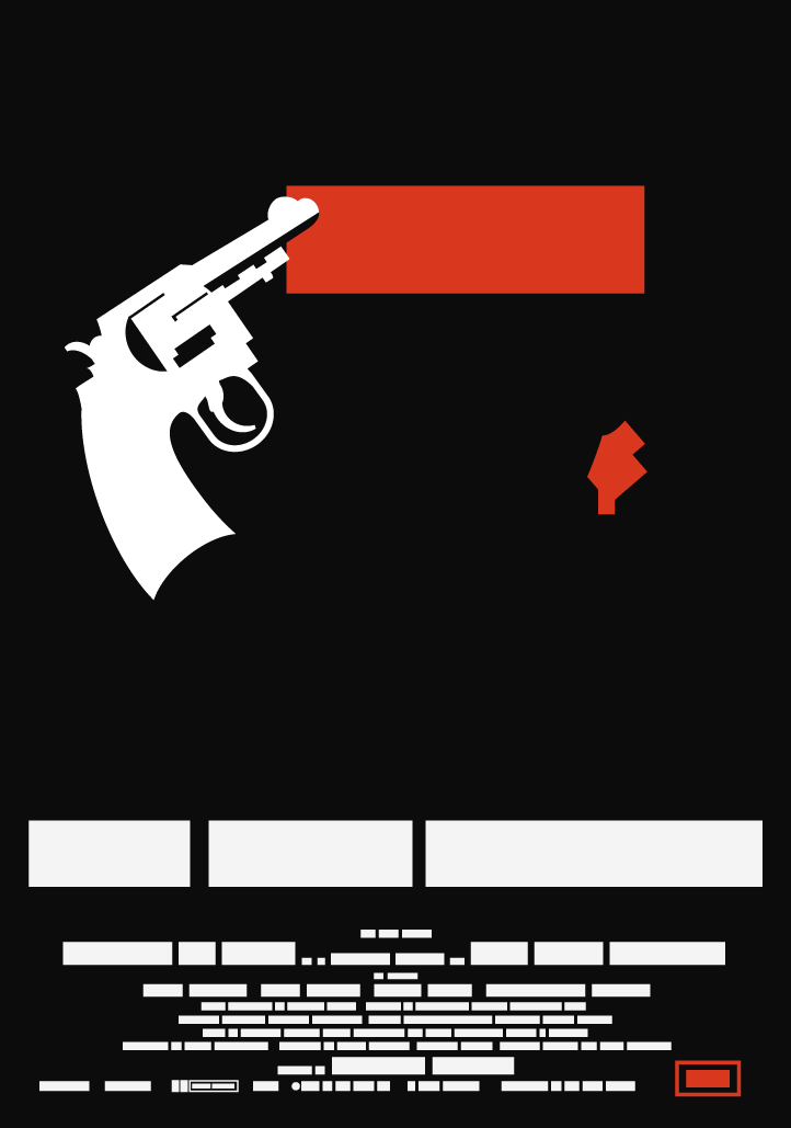
Another transformative tack on movie iconography comes from Andrey Kuznetsov, who has drawn images of blockbusters as if they were being advertised via Medieval woodblock print:


Any look at outre movie posters would be remiss to leave out the Polish poster designers who have both managed to create some perfectly poetic images for great films, and even some perfectly poetic images for terrible films (check out the Crocodile Dundee 2 poster at the link):


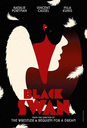
If you want on ongoing supply of great eye-candy and commentary on movie posters, Adrian Curry writes a Movie Poster of the Week feature for mubi.com. Curry is smart about the power of single images, like this one for Black Swan:


And he's equally adept at noticing trends in poster design -- for instance pinpointing the recent vogue of using title text to obscure the faces of the actors:


And here, finally, is the run of posters for the films in the indy film class. I tried to find original posters (not subsequent redesigns). One thing that becomes apparent is that the 80s were as ugly in movie poster design as they were in everything else; the posters for Before Sunrise and Do the Right Thing are easily the worst of the batch, in my eyes. It's funny how few of the posters actually conjure a flavor of the movie they're promoting -- the one for Persona does it, and that's about it (though several of the other posters are still attractive on their own terms).

There's an interesting story behind the poster for Nothing But a Man, an emotionally intense neo-realist look at a black railway worker in the American South. In listening to an interview with the filmmakers, Michael Roemer and Robert Young, I found out they were angry about the poster. Nothing But a Man was a pioneering film with a largely black cast; the filmmakers intended the film to play in black neighborhoods, but the distributors confined it to the art-house circuit of the time (1964). By making the image a drawing against a white background, you could almost not know the movie stars black people -- the poster actually unwittingly recapitulates a monologue delivered by a preacher's wife, played by Abbey Lincoln, late in the film. She mentions to her husband that she has more latitude than he does, in the white-dominated South, because she's not seen as a physical threat to white men. And there her face stands on the poster, whitewashed and also obscuring the masculine (and unmistakably African) features of the actual protagonist of the film, Ivan Dixon.


Friday, February 18, 2011

Friday Random #2

On certain Fridays I'll post five more or less random images, culled from a folder I keep for images downloaded from the internet. I offer them without comment or context -- sometimes I've forgotten the context and origin of the images myself (you can always avail yourself of tineye.com if you're feeling desperate). They're simply things that, for one reason or another, caught my eye and imagination. You can click on them to see larger versions. Here's today's batch:


Thursday, February 17, 2011

A place. An object.

John McCraken
Magic
2008
Stainless steel.
104x14 1/2x17inches 264.2x36.8x43.2cm

Wednesday, February 16, 2011

Tribute on Glass


Several poems have been transcribed on the glass of the second-floor entranceway of David Hall. I don't know who did the transcribing, but when I saw the attribution, I saw the story behind it was a sad one:
In loving memory of
Dayton William Lane Moore
Aug 1, 1992-Feb 6, 2011
a collection of original poems

Stop on by and have a read, when you get the chance. An obituary for Moore can be found here.


[Edit: Anza did the transcribing; more info at her blog here, and here.]

Ruined

Still playing a bit of catch-up with last semester -- here are notes and pics from Aurora's BFA show.

It's perhaps a little surprising to see such a young artist preoccupied with the idea of the "ancient" -- in the way Aurora Winkler filled the gallery with newly-minted ruins. Although it could be argued that the tremulous state of contemporary culture -- the weightless burden of instant obsolescence, the way everything is made from air, blown into different shapes from one moment to the next -- could easily drive one to the refuge of the past. It's a refuge that may be fragmentary and shattered, but what remains at least gestures to a form of permanence. Seeing Aurora's work, I was reminded of Manuel Neri's deliberately eroded figures; I wrote about them elsewhere that they seemed a kind of "pre-emptive sculpture": if time was eventually going to have its way with them, why not cut to the chase, and invite the connotative gravitas that accrues to history's scars and amputations?


There were certain details in Aurora's work that tweaked the idea of a vanished past -- indications that we, the audience, were not standing in the present looking backward -- but rather were were being sent into the future, to view the present day through a scrim of disaster and abandonment. On some of the cracked clay surfaces were spatters of iridescent paint -- vivid, unnatural, chemical -- that were meant to reference the toxic bequeathal we're making to unknown generations. We won't just be leaving ruins -- we'll be leaving irradiated ruins.


Some of the smallest pieces were the most evocative. There were a few ambiguous forms set on simple wood shelves; perhaps they amounted to fragments of vessels, but it was hard to say for sure. It was impossible to tell how "complete" these forms were, or if they suggested a certain self-sufficiency of incompleteness (maybe that's too contradictory, but I'm thinking of artifacts like Sappho's poems, which, with their accidental elisions, seem almost boldly Modernist).


At the risk of being too syntactically cute, the work played with the tension of intention. There was something provisional about the presentation -- shelves, wood palettes, lighting that seemed to derive more from excavation than exhibition -- suspending the objects between the fictional culture that created them, and the equally fictional culture that dug them up and put them on display. How much of the meaning of the objects emanates from the "originating" culture, and how much from the anthropologist culture, reassembling the pieces in its own image? One wall had a scattering of fragments assembled in the broken shape of a human torso and head. Was it a forensic reconstruction of an original configuration -- or did it simply speak of our desire to see our human image in the flotsam and jetsam of the past, even to the point of projecting a human image onto pure rubble? (This thought was probably provoked by the time I spent in New Hampshire, a state that had as its emblem the Old Man of the Mountain, a profile of mountainside granite that had to be lashed together with bolts and cable to preserve its human echo -- until gravity finally overtook resemblance).


The torso-assembly worked especially well with the shadow-play in the gallery. A floorbound lightbulb threw the silhouettes of the audience up there on the wall, to fill in the fragmented outlines of the shape. The whole gallery functioned as a shadow-theater, and that was key to the show's success: in direct light, the pieces looked unconvincing as stage-props seen up close. On the stage, props are leant history by the blur of distance; in the more intimate gallery space, distance was leant by shade. My favorite element of the show was an archipelago of wrecked clay, with a bare lightbulb laid on the floor in front of it. It was easy to imagine a play, with miniature actors, transpiring there -- among the ruins of a volcano-smashed Pompeii, or a bomb-smashed Berlin. A drama had taken place there, and it was primed for a drama to take place there once again.


I have to admit I was skeptical of Aurora's decision to hold her artist's talk in the gallery itself, just because the acoustics and cumulative body heat there can be oppressive. But among the shadows she'd invited, reading from an oversized book on Jung, I understood the importance of her maneuver. It was appropriate for her to step into the shoes of a storyteller, reaching back for that ancient continuity: the person holding court via apparition and firelight.